Do you plan to launch a conscious brand? We understand – like no other – that you’ve invested a lot of time and money in your new product or service. We know from our own experience that designing a brand identity for your business takes time and requires the right knowledge. How do you design a good logo? What colors and typefaces fit your brand? How will you communicate your new brand to the outside world? So many things to consider..
Don’t worry, we love to help you market your business professionally, and in a low-budget way. Designing strong brand identities has a lot to it and goes way beyond just picking the right elements. We can’t possibly cover everything, but in this blogpost we’ll cover the basics to get you started.
First of all, why is a strong brand identity so important? To summarize briefly:
- It ensures recognizability. Your brand identity is the face of your brand or company
- Good branding strengthens your message
- A strong brand identity gives you a professional and trustworthy look
Your branding consists of two parts: brand strategy and brand identity design.
After completing the brand strategy (and the why, how and what), you’ll dive into the design process of your brand identity. In this blog, we will focus on this second part – the visual aspect of the branding. Are you a creative entrepreneur and interested in the first part, developing the brand strategy? We highly recommend Creative Business Map. You can buy the book or download it for free. The book helps you as a creative entrepreneur to be stronger and more successful in your business. It’s a method to develop a business model quickly, easily and in a systematic way. It covers the drive behind your business, the what, who and how. It’s not a replacement for your business plan, but it gives insight into the basic plan of your enterprise, in a short, clear and visual way.
1. Logo
Having a strong logo is key, it’s an important design element within your brand identity. A strong logo is unique yet simple and memorable. It’s more than just a visual, your logo breathes the essence of your brand. It’s a recognizable symbol that represents your company’s core values and it will be the heart of your branding.
Typically, a logo consists of either a symbol in combination with (often) smaller text (logo symbol) or just the brand’s name spelled out in text (wordmark/logotype). Your brand could also use a combination of both. How to make a decision for your brand? We’ll outline some pros and cons of the different logos below.
Wordmarks (or logotypes)
A wordmark is a textual logo, focused on the business name. When you’re just about to launch your business, the first few months will be spent working to get your company’s name out there. A wordmark is a logical choice if you haven’t built up any name recognition yet. By frequently showing your company name, it will stick more easily and your business will be more easily found online. An image logo without a name is of course impossible to find;)
A wordmark is more than the business name designed in a nice typeface. The letters should be adjusted to create a unique typography for your logo. Besides this, you have to be aware of the letter spacing, font weight, color palette and size. Some companies succeed in developing their wordmark in such a way that it is iconic in itself, without using an icon or symbol. Just think of Google.
A wordmark logo:
+ provides name recognition
– is not the right option for a long company name
Logo symbol
A logo symbol is a more abstract representation of the brand. With a figurative mark, a symbol is used as a logo. This symbol has to increase the recognizability of the business.
A good example of an iconic logo symbol? Think of Apple’s Apple or the Twitter bird.
A logo symbol:
+ ensures recognizability
+ communicates a message
– the company name is more difficult to identify without text
![]()
Combine a symbol and wordmark
A combination of text and a symbol is frequently chosen. The symbol strengthens the word mark. Recognizable examples of sustainable brands are Patagonia, TOMS and WWF. Remember: less is more. Your logo has to be clear and simple above all else. Ideally people should be able to draw your logo easily. You can use a tagline in your logo if you want to put extra information in your logo. In that case, it is important to have one logo with tagline and without, because the tagline often becomes too small to read in smaller applications, like in an Instagram profile picture.
Tagline
A tagline is a short easily remembered phrase that communicates a message of your brand. The purpose of a tagline is to convey your company’s mission or vision. In a way that will be remembered. A good example of a tagline: “Just Do It.” – Nike.
Note: make sure the tagline doesn’t draw more attention than the logo. Make sure the font of the tagline is smaller than your logo.
A good tagline:
- evokes emotion
- shows what you stand for and its value to others
- is short, simple, effective and powerful
2. Brand colors
Next up: your brand colors. The colors you pick will be the colors that your brand will be associated with. These will be the colors that you’ll use throughout all your marketing and branding materials. Colors evoke certain emotions and therefore play an important role in the appearance of your brand. That’s why it’s important to dive into the basics of color psychology.
So how do you choose the right color palette? Firstly, it is important to have your brands’ core values clear, because these core values will determine which colors go best with your brand. The colors you choose have to reflect the right values.
Tip: emotivefeels.com is an interactive dictionary to help brands, entrepreneurs and designers explore the meaning of emotions.
Warm versus cold undertones
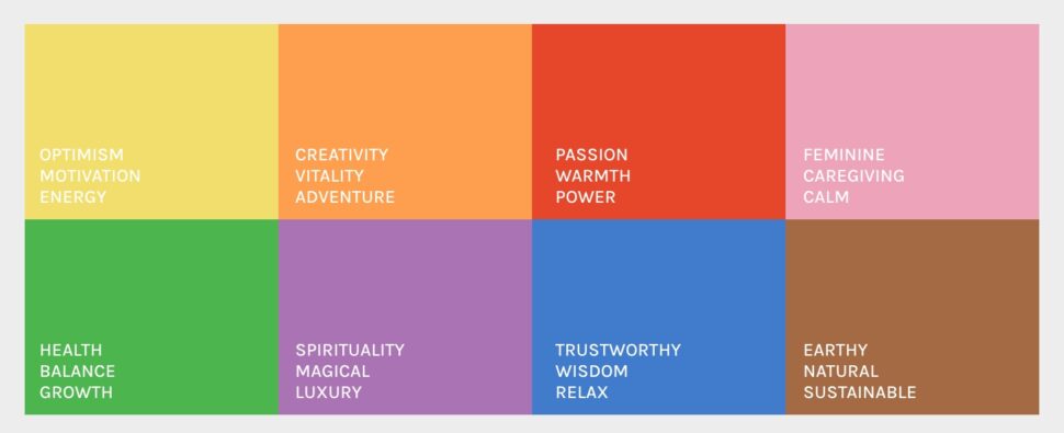
Colors with warm undertones (red shades) have an energetic, happy, cheerful and active effect. On the other hand, colors with colder undertones (blue shades) have a more serene, calming and (sometimes) serious effect. In short: warm colors have a stimulating effect, while colder colors have a calming effect. Are you curious about the effect of individual colors? Here a small summary by The Conscious Content:
Blue
Blue represents calmness, relaxation, wisdom, responsibility, trustworthy and authority.
Does blue also have unfavorable characteristics? Yes, unfortunately every color also has negative associations. Blue is considered a ‘cold’ color and can be seen as icy, conservative and businesslike.
Purple
Purple is associated with creativity, spirituality, luxury, magic and comfort. The negative characteristics are arrogance, depression and instability.
Yellow
We associate yellow with positivity, light, motivation, optimism, energy and fun. Disadvantages of this color? Sometimes yellow can be a bit too much and over-stimulative. Yellow is often associated with discounts, so this color can be seen as ‘cheap’.
Red
Red represents passion, power, warmth and excitement. The adverse association of this color? Red is used as a warning color and is therefore often associated with danger, provocation, aggression and impatience.
Orange
We associate the color orange with creativity, fun, adventure, vitality, kindness and optimism. Are you curious about the disadvantages? Orange can be seen as cheap, rude or untrustworthy.
Green
Green is the color of growth, development, balance, harmony, health, nature and youth. Negative associations of green are greed, boredom and jealousy.
Pink
Pink is the color of feminine, romantic, tenderness and sweetness. Unfavorable association of rose is weakness and childishness.
Brown
We associate the color brown with earthy, natural and sustainable. Negative associations of brown can be: boring, dull and old-fashioned.
Gray
Gray is the color of neutrality, organization and timelessness. Disadvantages of this color? Gray can be seen as dull, unconfident and lacking energy.
White
We associate white with peace, pure, innocence, purity, perfection, clarity and balance. Adverse qualities of white are sterile and cold.
Black
When you think of black, darkness and heaviness may come to mind. However, black also has positive qualities such as strength, modernity, authority, glamor and elegance.
Context of color
With all of that said, we’d like to emphasize that the meaning or association of colors can vary and depend on culture, history, location, gender, personal experience and so much more. So keep your target audience closely in mind when choosing your colors. We tend to rationalize from ourselves, but it’s important to put your target audience first. They should be attracted to the look and feel of your brand identity.
The combination and specific shades of a color also influences how colors can be conceived. For example: orange combined with blue can feel sporty and fast, while orange in combination with a pink shade can feel a lot more feminine, soft and playful.
Typefaces and fonts
Next brand element on the list: choosing the right typography for your branding. Where do you start and which factors are important? With this step, it’s (again) important to keep your core values in mind. Ask yourself: which message do I want to convey? What kind of typeface matches the look and feel of my brand?
A luxury brand that sells sustainable clothing probably uses a different typeface than a green tech company. When picking a typeface, keep in mind that fonts can be divided into categories (there are more categories than listed below, but these are the most commonly used). We’ll make a simple summary for you:
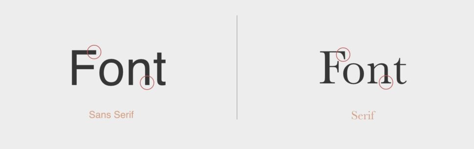
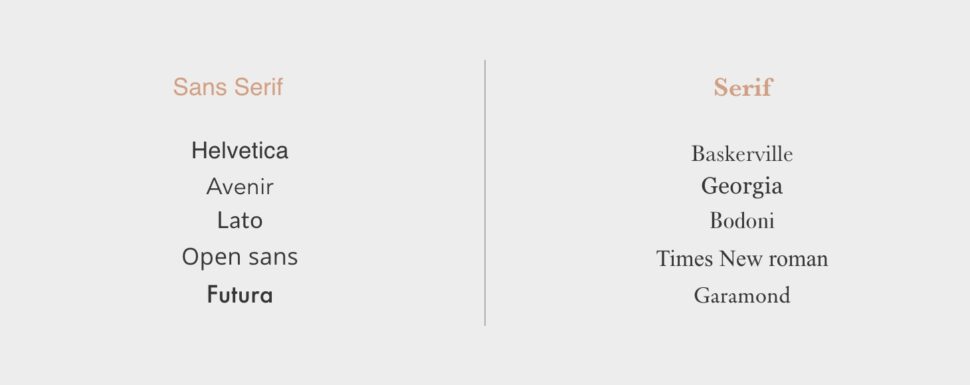
Serif typeface
“A serif is a decorative stroke that finishes off the end of a letter’s stem. In turn, a serif typeface is a typeface that has serifs, while a sans serif is a typeface that does not.” (Source: Impactplus).
A serif typeface has been used for print since a long time, because a serif typeface makes a longer text easier to read. A serif typeface is in general a little more classic, trustworthy, serious, formal and traditional and is widely used for books, newspapers and magazines.
Sans-serif typeface
Sans-serif has a more youthful, modern clean and minimalist look. By using large round letters and thin lines, sans-serif can also have a playful vibe.
Sans-serif typefaces are mainly used with digital texts. The serifs interfere on a screen, because it’s composed of pixels.
Script typeface
A script typeface is based upon hand-lettering and calligraphy. They tend to have a unique, imperfect, handmade look and feel. A script typeface instantly gives your brand its own personality. When using a script font, keep in mind that it’s not suitable for longer texts, because of the readability. A script font – in our opinion – should only have a decorative function within your brand identity and should always be combined with other more basic typefaces.
Now that you know the difference between serif, sans-serif and script, review your brands’ core values. What do you intend to express? A modern and clean look or a more playful and youthful look? Consider whether the typeface fits well with the rest of your brand identity and whether all elements strengthen each other. Do you work with a warm color palette and would you like to look professional, warm and calm? In that case a bold and playful font can be too overwhelming. An elegant, thinner font might be more appropriate.
It’s not uncommon that more than one typeface or font is chosen for a brand identity. Ideally, do not combine more than 2 different typefaces to keep things simple. You can combine a serif with a sans-serif typeface, be playful and creative if it fits your brand. You can also choose one typeface and vary the spacing or font weight. This way you can use a bold font weight to accentuate certain text, but still have a font that fits perfectly with the rest.
Tip: don’t be afraid to combine serif with sans-serif. Try it out, you’ll be amazed by the result!
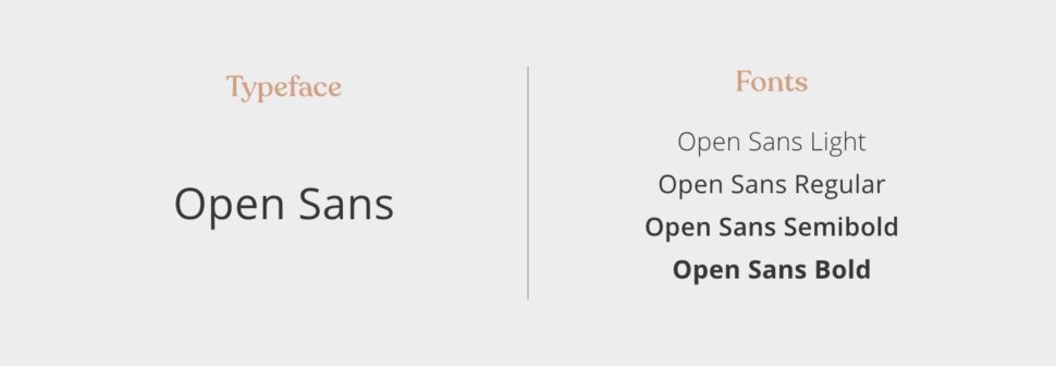
Font weight
We like to choose typefaces with a wider range of choices. You can vary the thickness of the font in your branding. You have several options in font weight: light, regular, semibold or bold. Using different font weights creates a clear text hierarchy. Use a thicker font to accentuate a text.
Are you struggling to choose the right font weight for your logo? Thin or light fonts generally have a more soft, feminine, elegant, clean, modern and delicate look. Always check your logo/typeface combination in smaller applications. Is it still readable enough?
Bold fonts are more often seen as powerful. Are you using a round bold font? Then you achieve a more playful and youthful look.
Spacing, size and line height
Spacing, font size and line height are very important in text readability. Using a bit larger distance between lines makes the text easier to read. Variation in font size creates a clear hierarchy. By making headings and titles bigger you can create a clear contrast between these headings and titles and the body text.
The typeface used for a logo, heading and other striking words is often more prominent than the body text. The typeface used for body texts should be easy to read, but also fit in with the rest of the branding.
Tip: make a clear overview of all your used typefaces and variations. This allows you to easily see if the fonts and variations fit together and if the hierarchy is consistent.
Free typefaces and fonts
Please note that not all typefaces and fonts are free (remember, someone actually created them and poured their heart and soul into it ;)) , especially for commercial purposes. Always double check the licensing of the specific typeface before downloading or purchasing it for commercial purposes. We like using Google Font and Adobe Fonts.
Other websites where you can download free typefaces/fonts:
– dafont.com
– fontsquirrel.com
Hopefully these tips will give you a boost in designing your brand identity. We recommend searching the internet for some ideas. Socials like Pinterest and Instagram are also great places to get inspiration. Save colors, images, etc. to create a mood of your brand identity. But also don’t be afraid to pull inspiration from other places like museums and art, nature, architecture, fashion etc. This will help you to develop your unique and stunning brand identity!
Have any questions about this blog, Branding Basics Part 1? Don’t hesitate to contact us, we would love to help you create your brand identity for your conscious brand.
Excited about what’s to come in part 2? In the second part we will explore shapes, icons and style elements that create recognition. How do you translate these visual aspects to your website, socials and print media? We will also add a downloadable template for your brand identity. To be continued!